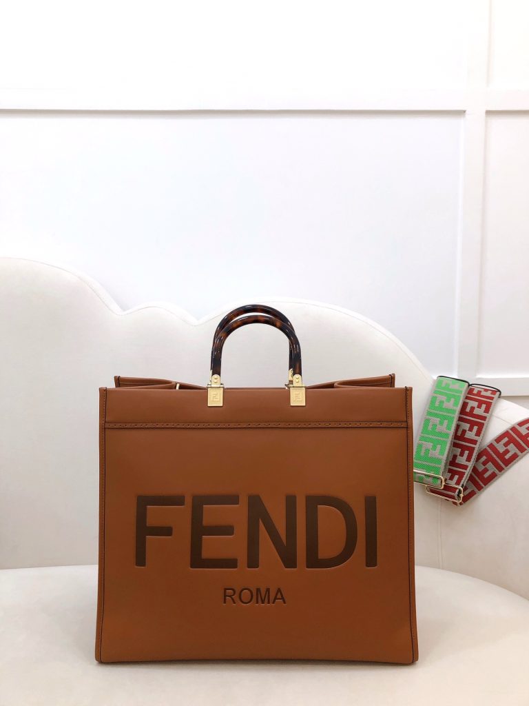
Now, hold on, I know what you’re thinking: “Sacrilege!” But hear me out. I mean, looking at all these different places to download the Chanel logo (SVG, PNG, EPS, ICO… seriously, who needs *that* many versions?!), you kinda realize how much of the brand’s power is tied up in just *that* symbol. It’s the visual shorthand for, like, everything Chanel stands for: luxury, class, timelessness… and, let’s be honest, a whole lotta money.
But *is* it, though? Is it *really* all about the logo? I kinda wonder if, maybe, the actual designs, the quality of the materials, the freaking *history* of the brand… gets a bit lost in all the logo-mania. You know? Like, you see the CCs, and you immediately think “CHANEL!” but do you actually *see* the tweed jacket? Do you *feel* the weight of the quilted leather? Probably not, because your brain is already screaming “STATUS SYMBOL!!!”
And honestly, isn’t that a little… sad?
Okay, okay, I’m not saying Chanel should ditch the logo completely. That’s just… crazy. Their marketing department would have a collective heart attack. But maybe, just maybe, they could experiment with a line of, like, *super* subtle, logo-free stuff. Think whisper-quiet luxury. Clothes that scream “I’m rich and I don’t need to prove it” instead of “LOOK AT MY EXPENSIVE HANDBAG!”
Plus, think about it: it’d be a total power move. Imagine walking into a room in a perfectly tailored, logo-less Chanel suit. People would *know*. They’d just *know* it was Chanel because of the cut, the fabric, the overall… *vibe*. It’d be like a secret handshake for the ultra-rich. A “if you know, you know” kind of thing.
